
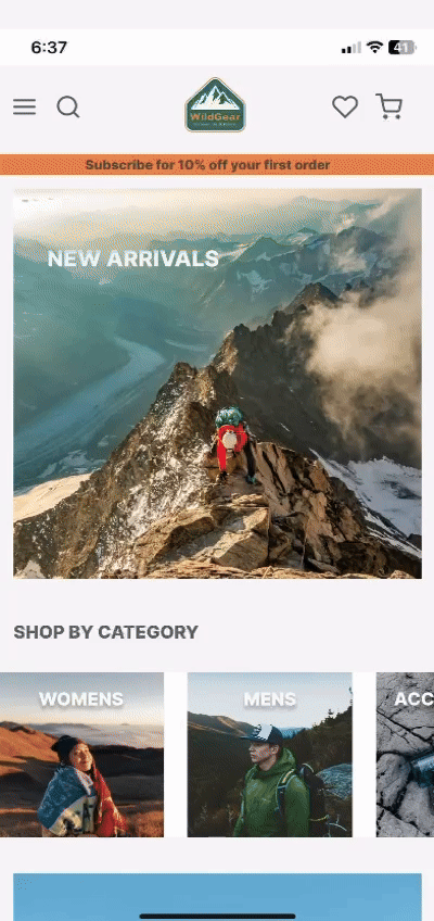
Wild Gear
End to end development for an e-commerce site, designed mobile first for outdoor gear lovers.
Wild Gear is an outdoor adventure equipment retailer known for quality products that cater to outdoor enthusiasts and nature lovers.

Challenge
Research and design an e-commerce website that captures the spirit of outdoor adventure, attracting and facilitating the needs of outdoor enthusiasts. Designing for mobile first with the intention of expanding the desktop.
Goal
Create an end-to-end application that is tailored to their customer base, with a seamless user experience allowing for personal preference, fostering a sense of community and promoting sustainability.
My Role
UX Research
UX Design
UI Design
The Discovery
Goals
Understanding the motivations behind customers specific purchases.
Determine how much customer reviews influence decision making when purchasing.
Recognising users pain points when using e-commerce websites.
Gain insight to the level of importance of environmental and social impact on customers decisions when purchasing.
Methodologies
Secondary research on leading outdoor clothing companies to identify successful design elements.
Carry out SWOT analysis of competitors to highlight strengths and weaknesses.
Conduct 12 participant online surveys with mixed age ranges interested in outdoor activities to record patterns and preferences in their shopping habits.
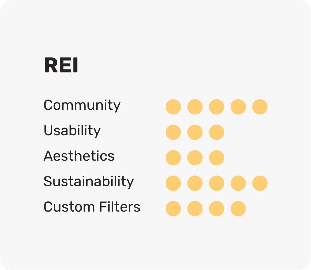
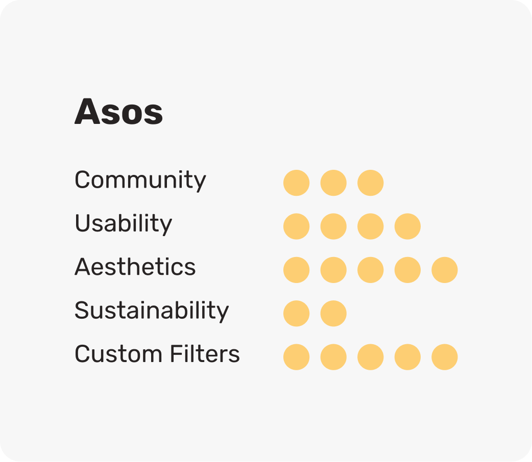
Competitor Research
I analysed direct and indirect competitors, focusing on community engagement, usability, aesthetics, sustainability, and custom filters. Most brands shared similar layouts for user familiarity, though usability varied throughout. The importance of sustainability also differed, some brands mentioned it briefly, while others made it a core part of their ethos.
Combining this research with a detailed SWOT analysis helped me identify competitors' strengths and weaknesses, guiding clear improvements to the overall design and experience for my users. These insights were further validated by user survey feedback.


User Survey’s

Following the competitor analysis I launched an online multiple choice survey of 12 participants, with the key intention of understanding the target audience and their main pain points, key combined findings are as follows:
Strengths:
Emphasis on high-quality products and convenient shopping experience, supported by both SWOT and survey results.
Strong community and environmental focus, with significant interest from customers in sustainability.
Positive brand reputation and customer loyalty acknowledged by both analyses.
Weaknesses:
Digital experience issues highlighted, including dissatisfaction with mobile app navigation.
Pricing concerns identified by survey respondents, echoing SWOT's observations about perceived high prices.
Define
User Persona

To better understand user goals, needs, and behaviours, I created four personas based on user surveys and research. Their frustrations, goals, and pain points guided my design decisions, keeping users at the centre of the process.
I developed empathy maps for each persona to visualise their experiences, deepening my understanding of their needs. These insights led to storyboards that highlighted key pain points and user journeys.
Together the empathy maps and storyboards helped me define a clear problem statement and create user-centred design solutions.
Problem Statement
Customers often prefer using a desktop site over a mobile site, this is due to mobile sites having poor navigation, usability and design.
This is a problem as it can divert users from online shopping leading to lost sales and missed community engagement opportunities.
Because of this, our design needs to address the users needs to create a seamless, clean, clear and simplistic shopping experience.
UI Moodboard
By collating a mood board to look at design layouts, styles, media and colours. I was able to identify key patterns in popular brands to later inform my own design choices, such as the following.
A mixture of action and product images maintaining a modern and on trend style.
Clear user friendly navigation throughout.
Positive and complimentary colour scheme.
Clean layout, not distracting or over complicated.


Ideate
In the ideation phase I collated key insights from the define stage and brainstormed solutions focused on clear navigation, simple design, and detailed product information.
Affinity mapping helped me to organise ideas into five categories - functionality, aesthetics, content, community, sustainability, and navigation.

Feature Prioritisation
To align the site’s information architecture with user expectations, I led five in-person open card sorting sessions for 30 products. I analysed the item pairings which led to five key categories: Accessories, Clothes, Equipment, Activity Wear, and Worn Wear/Second-Hand.
This helped create the structure for our site map including subcategories created by users such as surfing, hiking and waterproofs.
User Flows
I created user flows for each persona including their key pain point, establishing their flow through the website.
I identified that all users had similar end goals, all four wanted to buy an item from the site, however, each faced a different specific pain point.
I combined all four user flows to create one more detailed user flow to display how all users would eventually reach their combined end goal.

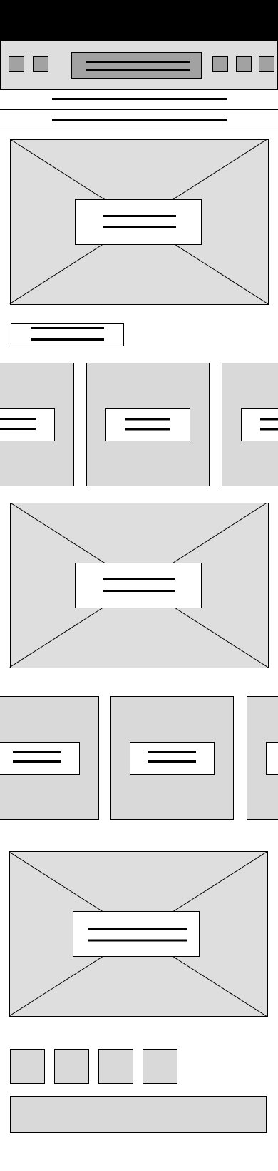
Lo-Fi Wireframes
After completing the crazy eight exercise I was able to refine my initial sketches in to lo-fidelity wire frames.
These designs were based on the primary and secondary research highlighting the users key pain points, goals and frustrations, along with meeting the needs of the company throughout their design brief. The first version of the lo-fi wire frames allowed me to run early usability testing to discover revisions prior to the hi-fidelity wireframes.
Iterations included adding breadcrumbs to help our users navigate clearer and changing the filter options to appear clear and immediately available instead of within the hamburger icon.


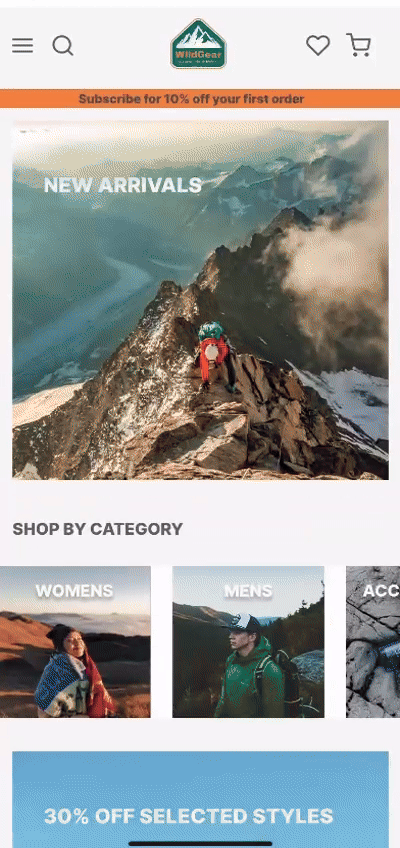
Clear Design Choices


Prototype & User Testing
Once I had created the first round of high fidelity wireframes I was able to complete a small selection of user testing, I found that these original designs required modifying to meet the users needs.
Key changes:
‘Profile’ was moved from landing page into hamburger icon.
Headers were added for all carousels.
Filter options were changed as they appeared too similar to the breadcrumbs.
Removed text of 'add to wish list' as too overcrowded.
With accessibility an important factor I wanted to ensure this was considered with all design options. One tool I used for this was the WebAIM Contrast Checker, this helped to ensure text and interactive elements meet contrast ratios for readability.


Here you can see the use of breadcrumbs for ease of navigation.
Demonstrating how users can return to any previous visited section by following the breadcrumb trail.
This feature improves navigation efficiency and helps the users have a clear idea of their location on the site at all times.
This video showcases a clear and intuitive filter system. It also showcases the complete user flow, from selecting a filtered product to navigating through and successfully completing the purchase.

Here we can see the horizontal and vertical scroll functionality, designed with clear visual hierarchy to organise the content.
This allows for a more compact layout whilst having smooth navigation and access to the brands key information.
User Testing
I tested the prototype with five in person usability tests, this helped me to discover any pain points of our users and highlight any revisions needed.
Here are the key take aways:
100% of users completed the tasks.
80% of users liked the layout and colour scheme.
80% of users found the navigation clear.
Improvements based on user feedback:
Expand the filtering option, as some users thought the filtering option could be more clear and have more detail including subcategories.
Include more information on items descriptions, users fed back they would like to see more information on specific items sustainability credentials.
Include clear information on shipping and returns.
Conclusion
While working on this project I was reminded of the importance of prioritising functionality and usability over aesthetics, it is often tempting to lead with aestetic choices, when in fact the most important thing is to keep the users needs at the centre of each decision.
By focusing on clear, easy-to-use features, I was able to design a mobile website that meets users needs while simultaneously promoting Wild Gears brand ethos. I found the most valuable aspect of this project to be the user research phase. By taking the time to thoroughly understand the user, I was able to make informed decisions that avoided assumptions and provided real solutions.
One of the most rewarding challenges was designing for a broad age range, as outdoor activities appeal to a diverse demographic. This experience reinforced the importance of user research in shaping a successful, intuitive design, ensuring the website is both practical and accessible for all users.
