
Elivio
Elevate your planning and alleviate your stress with scheduling.
End to end development for private and public medical professionals scheduling appointments on the go.
I started this project inspired by my history of working as a senior nurse assessor. I found there was a clear lack of streamlined approaches to scheduling whilst working in the community, I wanted to create a seamless approach and experience for medical professionals to incorporate into their day to day working life.

Challenge
Research and design a mobile scheduling app that links to a wider software for medical therapists and professionals to use on the go.
Goal
Create an end to end application that overall saves users time, creates a streamlined approach to scheduling their clients and is easy and straight forward to use.
My Role
UX Research
UX Design
UI Design
The Discovery
Goals
Understand the key pain points and barriers of the users and identify common trends.
Discover how users currently schedule their appointments and their current technical constraints.
Identify core needs for on the go scheduling.
Gain insight into the impact of time management on users.
Methodologies
Secondary research on key competitors and identify successful design elements and common setbacks.
Conduct five in person user interviews with a diverse group of therapists, with different age ranges and professional backgrounds.
Competitor Research
I decided to analyse both direct and indirect competitors to compare key features and understand how they position themselves in the market. The results were mixed, some apps allowed more detailed notes tailored to healthcare, enabling staff to link appointments with patient notes on a wider software platform, while others allowed for basic descriptions of appointments directed at a broader audience.
I also examined each app’s ability to identify conflicting appointments and display multiple schedules through app customisation.
The insights from this competitor research will inform my later designs, addressing gaps and weaknesses in existing platforms to create a more specialised app for my users.

User Interviews

I was surprised to learn that even highly experienced practitioners still tend to encounter challenges when scheduling appointments.
Many factors contributed to this, but they all stemmed from a lack of time in a face pace environment.
It became clear during research that all practitioners were affected by stressful schedules and complex caseloads, leaving little time to manage a streamlined scheduling process.
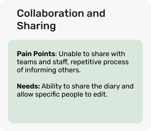
These interviews revealed five key themes across the board.
Our primary user group is health care practitioners, however, it is important to note that the client will also be using the app when receiving appointment details and requesting follow ups.
The end goal is related to the primary user group - the practitioners, however, it is important to recognise the client as a group of users with the intention of expanding the project to achieve a more holistic user experience throughout the use of the scheduling app.
Define
User Persona
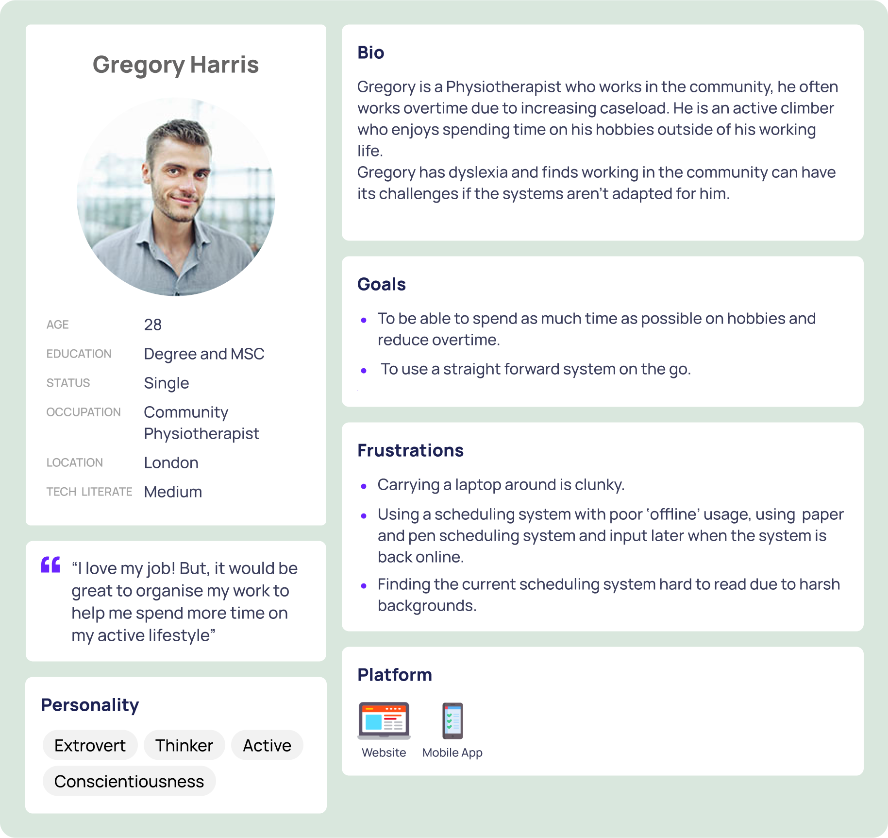
To better understand the users' goals, needs, and behaviours, I created personas based on the user interviews and secondary research. Alongside these, I developed empathy maps to visualise their attitudes and behaviours.
Their frustrations, goals, and pain points helped guide my design decisions, allowing me to prioritise key features that address user needs and keep users at the centre. This approach enabled me to make informed decisions throughout the design process.
User Journey
I developed a user journey for our persona to further understand his experience and discover his key pain points and frustrations. This process allowed me to clarify his goals and visually map out the steps he would take to achieve them.
Capturing each stage of his interaction, I was able to identify specific challenges and obstacles he might face while gaining a holistic view of his overall journey. This journey was crucial in highlighting opportunities for improvement.
The user interviews, user journeys and personas together helped me define a clear problem statement which lead to create user-centred design solutions.

Problem Statement
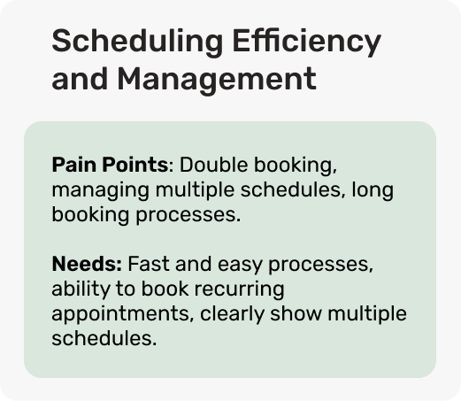
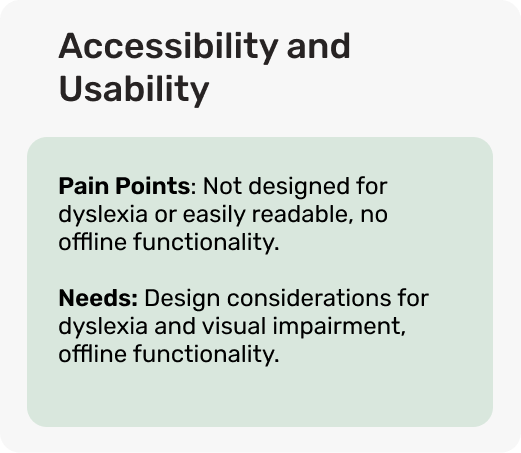
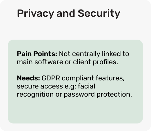
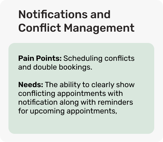
Community medical professionals often struggle with scheduling inefficiencies, including accidental double bookings, poor offline access and difficulty managing multiple schedules.
These can become problematic and can result in administrative burden and potential disruptions in patient care.
As a result, our design must provide clear conflicting alerts, seamless offline usage and an intuitive way to manage multiple schedules and reoccurring appointments. Ensuring a smooth workflow whilst keeping healthcare staff and patients centre to the design choices.
Ideate
Building on comprehensive research and key user insights, I explored potential design solutions that enhance efficiency whilst addressing the key user concerns.
My goal was to create an intuitive process that creates a clear and streamlined approach to appointment management whilst on the go.
Pivot!
I developed an initial set of low-fidelity wireframes and conducted in-person user testing during the early prototyping phase, the insights from the user testing highlighted some key aspects requiring development.
This brought me back to the ideation phase to address these pain points and dive deeper into design ideas to create solutions.
Key feedback points from user testing:
Home screen was too busy.
Complicated user flow throughout app.
Would like to see multiple ways to schedule appointments.
Long winded way of inputting clients and schedules separately through settings.
Improvements:
Strip back home screen to create a more streamlined user flow and to highlight key aspects of the app eg, ‘schedule appointment’.
Simplify navigation and user flow throughout app, including clear home button and scroll bar.
Input clients NHS ID, to link client to their contact details instead of having to input their details separately.
Add different schedules on appointment screen to save set up time in settings.
Feedback from users found that they were also frustrated with the format of low fidelity, so the next round of user testing I will complete with high fidelity prototypes to reduce frustration with the prototype format.
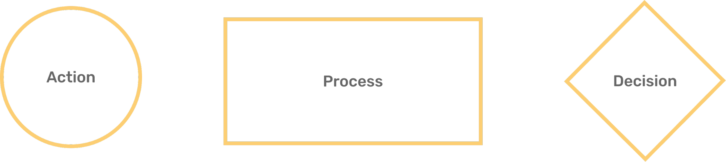
User flows
After identifying the solutions derived from the first round of user testing that best met the users needs and delivered the most value. I amended user flows to simplify how they would move through the app.
I want the app to be easy to use, clear and streamline while focusing on the main application of scheduling, whilst having the ability to connect to a wider software to provider healthcare staff the information they need whilst in the community.
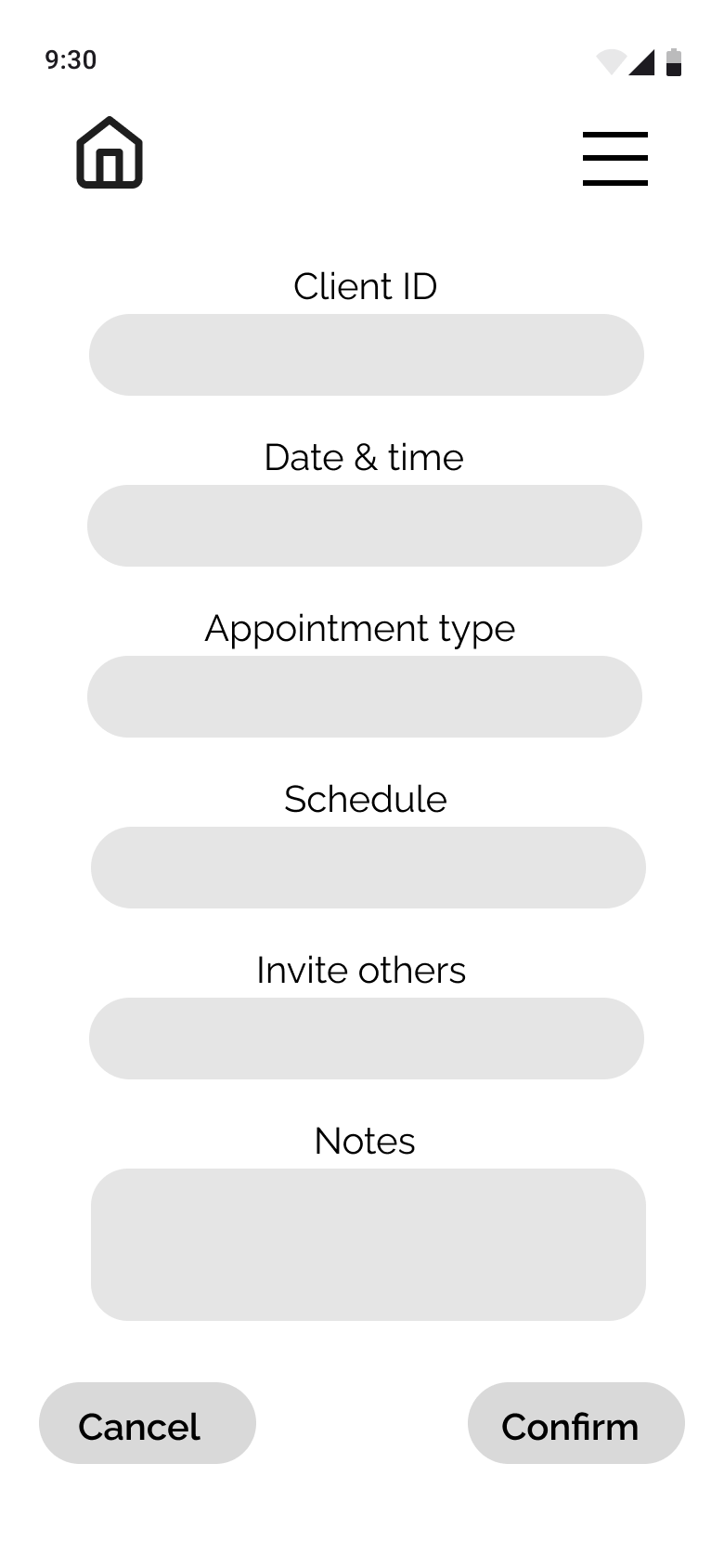
Task: Book an appointment through ‘Quick schedule’.

Task: Book an appointment through ‘Quick schedule’ with a conflict.

Lo-Fi Wireframes
Following brain storming and crazy 8 exercises I developed upon my first round of lo-fi wireframes to improve the designs using user feedback for development on specific areas reflecting the pain points found.
Developing a refined lo-fi version which incorporates research throughout the project and progressing with information found and created during the ideate phase. Keeping users at the centre of the design process to create a holistic approach.


Clear design choices


Prototype & Testing
I developed a high fidelity prototype incorporating the feedback from user testing in the ideate section and the branding and UI kit.
With accessibility in mind I wanted to ensure this was considered across the board with this design. I used the WebAIM Contrast Checker, this helped to ensure text and interactive elements meet contrast ratios for readability and are in line with WCAG recommendations, along with appropriate button size, clear navigation, different typography for headings and paragraphs and futher accessibility adjustments easily found in the hamburger icon.


This video highlights the accordion features.
Here you can quick access a calendar to add your date and time along with the option to add a reoccurring appointment.
The user can also choose from different schedules and input new schedules with personalised colours.
This feature saves overall time for the user, allowing quick and easy access to essential features.

This video demonstrates how a user would flow through the app from quick schedule to confirmed appointment while being faced with a conflicting appointment.
The user has the option choose an alternative appointments suggested by the app, select an appropriate alternative and confirm the appointment.

Here you can see the ability to schedule appointments through the calendar page, this provides the user with multiple ways to schedule appointments.
The user can also choose to override their conflicting appointment, allowing the user full control of their scheduling.
User Testing
I tested the prototype with five in person usability tests, this helped me to discover any revisions needed before launch.
Key insights from users:
Five out of five users were able to complete tasks within the app.
Four out of five users liked the overall design for conflicting appointments.
Four out of five users felt navigation was clear throughout the app and felt this would save them time working in the community.
Improvements based on user feedback:
Redesign the scroll bar to be smaller, less invasive in the overall apps design.
Widen the size of the text field bar on the appointment screen to accommodate for more information.
Conclusion
Elivio was designed to address the daily scheduling inefficiencies healthcare professionals face, such as scheduling conflicts, administrative burdens, and managing multiple schedules. Through research, user testing, and iterative design, I created a design that streamlines appointment management, prevents double bookings while maintaining user control, and integrates with primary healthcare software along with automated reminders.
By prioritising the users needs, usability and overall efficiency, Elivio reduces duplication of work and allows clinicians to focus on patient care. This project reinforced the importance of flexible, user driven design, with early testing playing a key role in refining a clean, intuitive interface.
Next steps include field testing, enhancing offline functionality, and further integration with healthcare systems to improve efficiency. This project highlights my ability to combine research, strategy, and design to create impactful digital solutions.